TEDxCam Hackathon
I spent Saturday at the TEDxCam Hackathon. This was an event which got together more than 40 coders to work in teams on a project in the area of data visualisation to compete for gadgets and tickets to the main conference.
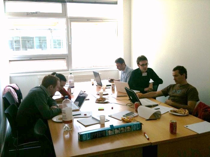
Here is our team, hard at work (thanks to Dawson King for the photo and Paul Querelle for the brightness fix):
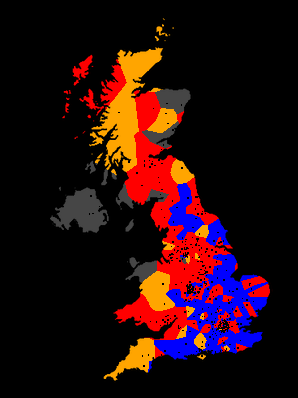
Our team decided to combine Timetric population data with general election outcomes from the Guardian to produce a movie showing the political evolution of the UK.
The idea was to colour each electoral constituency on the map with a color based on the winner of the election. There were several problems with completing this apparently simple task:
-
There is no good data source for where constituencies actually are, or what their boundaries are
-
There is also no good data source for population over time at a fine enough scale
-
The Guardian election data went back only 4 years
Of necessity, we had to find a smart way to use the limited data available. Because we didn’t know constituency boundaries, but might have been able to find their centrepoints, we decided to use a Voronoi diagram to approximate the boundaries. The idea of such a diagram is that you divide up the 2D plane into cells around each input point so that every point in that cell is nearer to that input point than any other. Graphically, that means drawing the lines in this diagram:

In fact, we decided to go one better than that, and used a weighted Voronoi diagram. In this scheme, cells corresponding to constituencies could grow depending on the population of voters in that region.
The idea was that we could then make a movie showing how these cells grew, shrank, and changed color over time. Unfortunately it didn’t quite come together on the day, but we did produce some lovely still images for the judges:
I spent some time on Sunday hacking the code up with some other data sources to produce a fully-fledged movie, which you can watch on Youtube. This version uses a power diagram, mainly because CGAL has some code for computing such diagrams much faster than we were able to compute our weighted Voronoi diagrams (10 minute rendering times became 10 seconds with this change!). Unfortunately, the code is buggier than a bucket full of cockroaches, as you will see if you watch the video :-)
The Hackathon was tremendous fun, even if our project didn’t turn out exactly as hoped! Thanks to the organisers (Cong Cong Bo and Dawson King) and to the excellent team who hacked through a long day to produce the stuff I’ve shown you above:
- Max Bolingbroke
- Nick Pilkington
- Paul Querelle
- Diva Tommei
- George Weller